A landing page has just one job: to get your visitors doing what you need them to. When it does that job to a high degree, it’s referred to as a high-converting landing page.
Everyone that runs a successful online business knows that landing pages aren’t there to simply host your visitors and show them a nice time. They have a key role to play, and that’s to get your visitors clicking links, buying stuff, and earning you money.
If you’re new to the concept of a high-converting landing page or want to learn better how it works, we’ve written this article to help.
Here, you’ll learn all you should know about landing pages that convert, including what they are and how Shopify helps you build high-converting landing pages.
Table of Contents
What are high-converting landing pages?
A high-converting landing page is like a superstar among web pages. This type of page has a conversion rate that’s higher than the average rate for landing pages.
Most industries have a landing page conversion rate between 2% to 6%. A high-converting landing page converts visitors at rates above 7%.
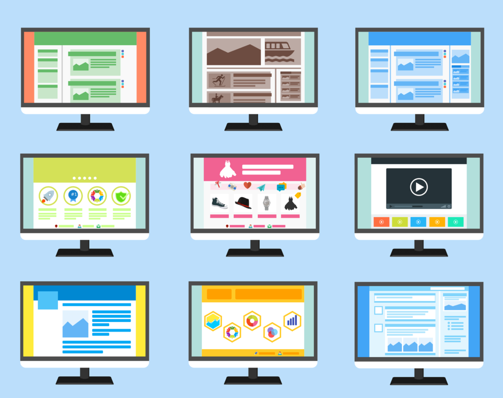
While there’s no one-size-fits-all formula for creating high-converting landing pages, tools like Shopify have carefully perfected the art of creating landing pages that convert.
With a wide range of themes, page builders and marketing tools, Shopify gives you all you need to create pages that convert like crazy.
Why Should You Use Shopify?
Shopify goes above and beyond to offer everything you need to create high-converting landing pages. Whether you’re getting into the exciting world of dropshipping, sales or whatever your business is, Shopify has more selling options than you can ever imagine.
Is Shopify Safe And Legit?
If you’re wondering “Is Shopify safe and legit?,” the answer is yes. Shopify is both safe and legit. All Shopify stores come with an SSL certificate that protects your customers’ security by encrypting all the data exchanged between user browsers and your Shopify store.
In addition, when you buy a new domain on Shopify or connect your third-party domain, you automatically get a TLS certificate. A TLS certificate is a security code that boosts network security between your customers and your servers to ensure the right transmission of encrypted messages.
One added benefit of Shopify is hosting your store on its servers, which is more secure than hosting your store’s files on a platform like WordPress.
Shopify also rewards people who spot any security vulnerabilities in Shopify’s code to ensure that the program is as safe as it can be. It also has risk analysis tools to verify the billing address, cross-check card information with the billing details and even run a background check against a list of known fraudsters. If anything seems suspicious, they automatically cancel the order.
If you’re looking for a safe and legit solution to start your e-commerce business and build landing pages with high conversion, Shopify is your best bet.
Shopify pricing plans
There are three main Shopify pricing plans designed to fuel your online business success. These are the Basic Plan, Shopify Plan and Advanced Plan.
Plan | Price | Features |
Basic Plan | $32/month |
|
Shopify Plan | $92/month |
|
Advanced Plan | $399/month |
|
Basic Plan
The basic plan is perfect for individuals and small businesses. If you’re just starting on your entrepreneurial journey, this plan is tailored for you.
Shopify provides you with all the essentials to create an amazing online store, from designing highly effective landing pages to shopping for products and processing payments. You also enjoy basic reports to keep track of your progress and flexibility of up to 1,000 inventory locations.
You also get two staff accounts to share the workload seamlessly. The monthly subscription price for this plan is just $39, but you can grab the first three months for only $1 per month.
Shopify Plan
This Shopify plan is your best bet if you’re looking to supercharge your success. With this plan, you’ll unlock professional reporting features and enjoy even more staff accounts. This powerful plan goes for $105 a month, but again you can grab the first three months for just $1 per month.
Advanced Plan
This plan is perfect for medium to large businesses who want to conquer the world of e-commerce. It’s an ultimate game changer that offers up to 15 staff accounts and top-tier features to help your business thrive. It goes for the price of $399 per month.
Other Shopify plans
These are not the only Shopify plans available. Shopify offers additional plans such as Shopify Starter, Shopify Plus and Commerce components.
- Shopify Starter: Looking to sell your products through social and messaging apps? This plan is perfect to kickstart your social selling journey by allowing you to showcase and sell your products seamlessly across popular social platforms. You can grab the first three months for $5.
- Shopify Plus: This plan is tailor-made for high-volume businesses that want an all-in-one solution. Shopify Plus offers many benefits like a central dashboard to manage multiple stores, a dedicated store engineer and access to free training. It starts at $2,000 a month.
Commerce Components: With this plan, you can choose the components you need for your business for three months. For example, you can choose the number of staff accounts you want and a preferred inventory number. This plan allows you to make your own unique Shopify store cocktail. With this plan, you can customize the components based on what suits your needs.
Shopify vs Shopify Plus
There are many differences to consider when comparing Shopify vs Shopify Plus. While Shopify is typically for small and medium-sized businesses, Shopify Plus is an omnichannel tool designed for larger companies with greater sales volume.
Shopify | Shopify Plus |
Designed for small and medium-sized businesses | Designed for larger companies with huge sales volumes and more complex e-commerce needs |
Support via phone, email and live chat | Dedicated account manager for specific tasks and guides |
Limited staff accounts and control | Unlimited staff accounts with control of staff permissions on admin front |
No API integration | Advanced API integrations |
No customized discount codes | Customized discount codes |
No separate password-protected storefront for wholesales | Allows you create a password-protected storefront for wholesalers |
No unified dashboard | Offers a unified dashboard |
No merchant success program | Provides a merchant success program |
Offers flat pricing plans | Pricing is $2,000 minimum / 0.24% of sales volume per month |
Although they have the same core offerings, Shopify Plus is created for bigger brands and offers more flexibility. On the other hand, Shopify is created for small businesses with less flexibility and smaller sales volume. Here’s a summary of the differences between these plans:
- A dedicated account manager: Shopify Plus offers dedicated support for your store, and you have an account manager to help you set it up and work specifically on your business. This manager or store engineer holds your hand and guides you through the process. You have dedicated 24/7 live support for your store. For Shopify, you only get support via phone, email and live chat.
- Staff Accounts: With Shopify Plus, you get unlimited staff accounts because of the sheer size of these businesses. You’ll have more control over what your staff can and cannot do. For Shopify, you can only have a limited number of staff accounts. Also, you have limited control of staff permissions on your admin front.
- API integrations: Another major difference is that Shopify Plus offers more API integrations. This means you can take full advantage of third-party apps. You can even build your own apps and integrate them as you build high-converting web pages! You can check https://www.functionize.com/automated-testing to understand how test automation can integrate with API-based systems like Shopify Plus.
- A Dedicated wholesale channel: Shopify Plus allows your business to create a separate password-protected storefront for wholesalers. This will allow you to offer the same products at exclusive prices to wholesale buyers and even offer customized discount codes unavailable on Shopify.
- A central dashboard: Shopify Plus offers its users a unified dashboard to get a complete overview of their businesses and all their multiple stores. A feature that’s nonexistent for Shopify users.
- Merchant Success program: Shopify Plus offers you a merchant success program to help you thrive. You are given training and help with products and third-party integration. You will also work with a merchant success manager and get 24/7 support. This isn’t available for Shopify users.
Pricing: Shopify offers flat pricing plans, so you pay the same amount irrespective of how many sales you make. Shopify Plus, on the other hand, charges $2,000 minimum or takes 0.24% of your sales volume per month.
How to build high-converting landing pages
Conduct Market Research
Before writing a single word, you need to conduct thorough market research. Conducting market research will help you understand your target audience, their needs and pain points.
This doesn’t only involve speaking to other professionals or reading up information online. A typical example of how to conduct market research would be creating a poll where people can tick what they do or do not like, as well as what they expect from the product or service you’re about to offer.
Also, identify their age, gender and other demographics. With this information, you can then create a landing page that speaks directly to them and compels them to take action.
Craft Compelling Headline
Your headline determines the success of your landing page. It should be compelling, concise and attention-grabbing. It should also clearly communicate the benefits of the solution you’re offering. There are several formulas that can help you create an outstanding headline for your landing page. An example is using the Agitator format which highlights a pain point a customer is facing. Examples under this includes headlines like:
- Tired Of (list the problem), We’re Here To Help You
- Want To Go From 6-figures To Earning 8-figures In Your Real Estate Business, Here’s Where We Come In.
Another is the more simple How-To formula where you go straight to the point and state the purpose of your landing page.
- How To Earn 8-Figures in your Real Estate Business
- How To Avoid Delayed Flights
Follow up with a persuasive subheadline
After an attention grabbing headline, you need to follow up with a subheadline that further engages your visitors. This is a good opportunity to expand on the unique product or service your headline was offering.
Use your persuasive subheadline to evoke emotion and curiosity to entice your visitors to continue reading. An example of a persuasive subheadline for a high-converting landing page include the following:
- An easy and practical solution to help you grow your real estate business and ensure you go from zero to hundred in earnings! Save 20% on the first two months of using (mention your product)
- Say goodbye to delayed flights, (mention product or service) keeps you informed all day, everyday.
Employ the right imagery
Include compelling images on your landing page. Images have the power to evoke emotions and captivate your audience.
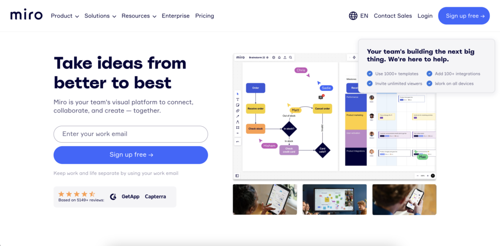
Ensure you use images that are clear, crisp and visually appealing. Also, include images that showcase the benefits or solutions that your product or service is offering. A typical example is Miro’s landing page with its very clear visuals.
Highlight core benefits
Highlighting the core benefits your product or service is offering is crucial to conversions. Emphasize the specific problems your visitor is facing and how you solve them.
Clearly and concisely highlight how your product will improve their lives and businesses. Use bullet points when possible.
Use psychology of color for design
Don’t just design your page without considering how color can help you communicate your message and speak to your audience. Use contrasting colors to draw attention to your CTAs.
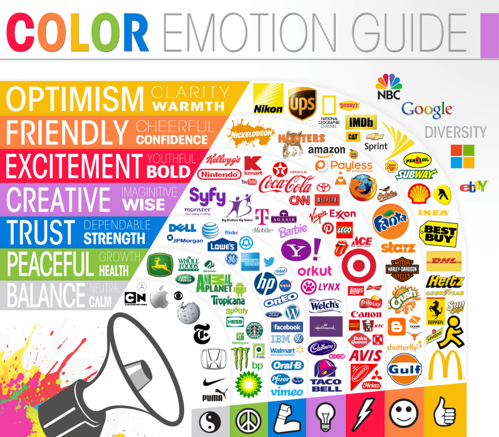
Ensure that your color palette aligns with your desired image. If your brand is feminine and soft, using black and gray for your design might not be the best choice.
Use a hard-to-miss CTA
Don’t end your landing page without using a strong and prominent call to action (CTA). A CTA guides your visitors to take the desired action you want them to take.
This could be to download a book or buy a product. To make your CTA hard to miss, ensure it is prominently placed on the page and use contrasting colors. An example is Shopify Plus CTA which is ‘Sell more, move fast, never stop’ and because customers may not likely make a purchase straight away, they are asked to contact sales.
Let your copy speak for itself
Your copy should be clear and concise. It should be able to engage your visitors and convince them to take action. Clearly communicate your USP and highlight how your product or service is the best solution for them. Ensure your copy contains multiple CTAs, highlight important words, ensure every word used is relevant to your brand and most importantly, ensure your copy communicates value.
An example is Semrush, an SEO platform with a compelling landing page targeted at digital marketers. Its copy targets a specific audience and highlights some of their biggest customers on the page to establish credibility and trust.
Optimize for SEO
Last but not least, optimize your landing page for SEO. This is crucial to increase visibility and attract organic traffic. Include high-ranking keywords related to your product in your copy and headlines. Optimizing your landing page for SEO will improve your ranking in search engine results and bring targeted visitors to your site.
High-converting landing pages examples
Netflix
Netflix’s landing page doesn’t include too much information. It goes straight to the point and highlights the benefits of the service – “Unlimited movies, TV shows, and more.”
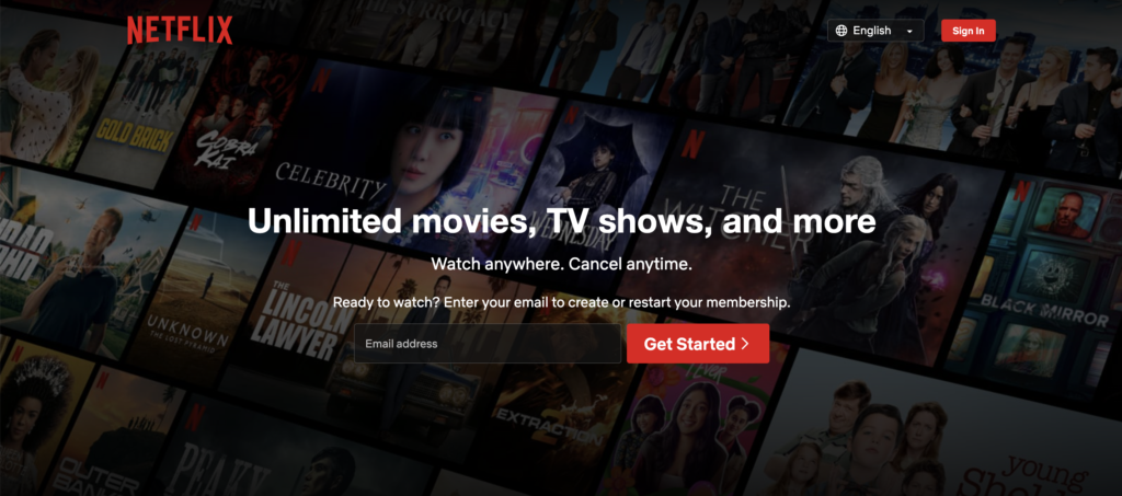
Then the landing page tells you how to get started by entering your email to create or restart your membership.
Dang Foods
Dang Foods knows that it has amazing food offerings with amazing packaging, and that’s exactly what its landing page sells.
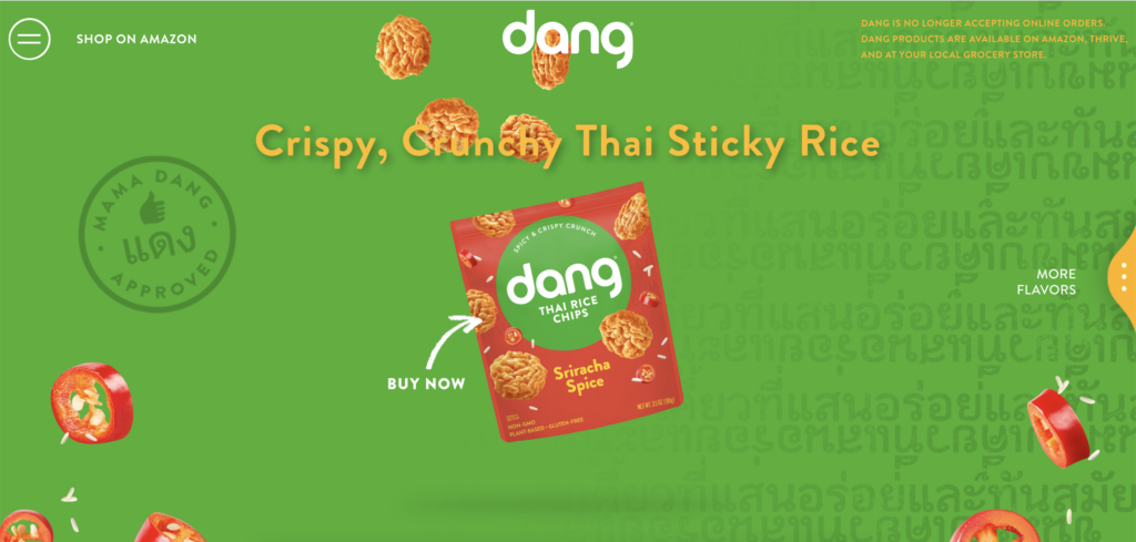
It focuses on a slideshow of mouthwatering product images and a CTA so clear it’s impossible to get confused. Straight to the point with an arrow directed to the mouthwatering package, it says, “Buy Now”. That’s a CTA that’s very hard to beat.
Conclusion
With high-converting landing pages, you can supercharge your marketing and sales efforts and enjoy much better results.
But that depends on taking the right approach and implementing all the best practices for building super landing pages. These include:
- Conducting market research
- Crafting a compelling headline
- Following up with a persuasive subheadline
- Employing effective imagery
- Highlighting core benefits
- Using psychology of color for design
- Using a hard-to-miss CTA
- Creating copy that speaks for itself
- Optimizing for SEO
Shopify makes it ten times easier to build high-converting landing pages by offering a wide range of features and resources.
It provides landing page templates and layout designs that are already optimized for conversions which you can easily tailor to your brand’s aesthetic.
Shopify also gives you access to amazing tools like PageFly. PageFly is a landing page builder that provides intuitive drag-and-drop tools that let you build pages faster and with even more granular control.


