Hello fellow eCommerce store owners!
Today, we’re going to dive into the exciting world of optimizing product pages to skyrocket your conversion rates. Trust me; this blog contains the secret sauce that can take your Shopify store from average to extraordinary.
Now, why is it so important to focus on optimizing your product pages?
On average, only 1.62% of eCommerce website visits convert into a purchase. To beat the average, you’ll have to make sure your product page is optimized for conversions. When you optimize your product pages, you:
- Create a streamlined and compelling shopping experience for your customers
- Make it easier for shoppers to understand the value of your products
And that, my friend, leads to one thing: increased conversions!
Table of Contents
Benefits of Increased Conversions for eCommerce Businesses
Okay, let’s talk about the amazing benefits that await you once you start reaping the rewards of higher conversion rates.
Picture this: more customers adding your products to their carts, completing their purchases, and becoming loyal fans of your brand. It’s like having a money-making machine that runs 24/7!
As entrepreneurs, we all want financial freedom; increased conversions mean more revenue.
It’s simple math, when more people buy from you, your sales skyrocket, and your profits grow. And who doesn’t love a healthy bottom line?
Oh, and let’s not forget the icing on the cake: higher conversion rates boost your credibility and authority in the eCommerce world. When people see that others are happily buying from you, leaving positive reviews, and sharing their experiences, it builds trust.
And trust, my friend, is worth its weight in gold.
So, get ready to roll up your sleeves and dive into the world of product page optimization. Trust me, the benefits are well worth the effort.
We’ll cover five main ways to optimize your product page and improve your conversion rate:
- Design and Layout
- Compelling Product Descriptions
- Social Proof and Reviews
- Free Shipping and Returns Information
- Practical CTAs
Now let’s turn your Shopify store into a conversion powerhouse and watch your business soar!
Design and Layout
Clean and Visually Appealing Product Page Design
As an entrepreneur, you understand the importance of aesthetics. When it comes to your product pages, a clean and visually appealing design can work wonders in capturing your customers’ attention and keeping them engaged.
Imagine a product page with cluttered elements, overwhelming colors, and an unorganized layout.
It’s like trying to find a needle in a haystack.
Here’s what to do to create a clean, visually appealing product page:
- Opt for a visually pleasing design
- Use white space to let your products shine
- Show off high-quality product images that showcase your creations in all their glory.
- Incorporate a minimalist approach that allows your customers to focus on what really matters – your unique products.
Consistent Branding and Product Presentation
Consistency is key!
Your brand is your identity, and your product pages should reflect that. Ensure you consistently incorporate your brand elements, including your product pages, across your website.
Everything should align with your brand’s personality and style, from your logo and color palette to your typography and imagery.
Consistency extends to how you present your products as well. Consider creating a cohesive product layout that showcases your items in a similar format. This helps customers easily navigate and compare different products.
When your customers see that every page on your store maintains a consistent and professional look, it instils confidence in your brand.
Clear and Intuitive Navigation
Ensuring your product page navigation is crystal clear and intuitive is crucial. Your customers should be able to find what they’re looking for without any hassle.
Keep your navigation menu simple and easy to understand:
- Categorize your products logically
- Utilize
- Drop-down menus
- Filters
- Custom site search
- Include clear and descriptive labels for each section
Doing these things will make it easy for your customers to find exactly what they need.
Mobile Responsiveness for a Seamless User Experience
Mobile shopping is on the rise, and ensuring that your product pages are optimized for mobile devices is important. A seamless user experience across all screen sizes can make a significant difference in driving conversions.
Test your product pages on various mobile devices to ensure they are responsive and display correctly.
Make sure that your images, text, and buttons are appropriately sized and don’t require zooming or excessive scrolling.
By providing a user-friendly mobile experience, you’ll capture the attention of customers who prefer shopping on the go.
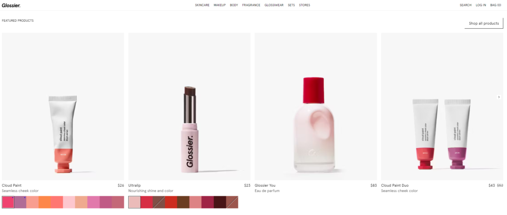
Example: Glossier
Known for their clean and modern aesthetic, Glossier’s product pages feature simple yet impactful visuals highlighting their beauty products that look great on mobile!
Compelling Product Descriptions
Crafting compelling product descriptions is a huge part of creating product pages that truly captivate your shoppers and drive those conversions!
Highlighting Key Product Features and Benefits
When it comes to product descriptions, it’s crucial to highlight the key features and benefits of your offerings. 85% of shoppers surveyed say product information and pictures are essential to them when deciding which brand or retailer to buy from.
Your customers want to know why your products are worth their attention and hard-earned money.
Take a moment to identify the unique selling points of each product. Is it made from premium materials? Does it have special functionality or innovative features?
Communicate these qualities clearly and concisely.
Remember, your goal is to showcase how your products can enhance your customers’ lives or solve their problems.
Utilizing Persuasive Language and Storytelling Techniques
Let me tell you a secret: persuasive language and storytelling can work wonders in engaging your customers. Storytelling increases the value of a product by up to 2,706%!
That’s right – I didn’t stutter – 2,706%!
Instead of simply listing product features, weave your product features into a narrative that connects with your audience.
To create a compelling story around your products, you can
- Share the inspiration behind the creation
- Describe how the product makes a difference in the lives of others
- Illustrate how the product will benefit the customer’s life
- Use AI writing and prompting tools, such as Prompt Vibes.
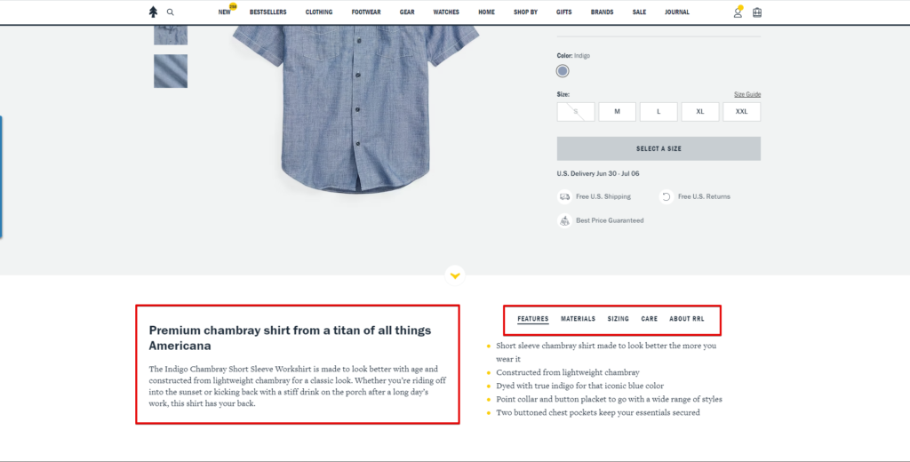
Example: Huckberry
They use persuasive language and storytelling techniques to create vivid descriptions that immerse customers in the lifestyle and experiences associated with their products.
Addressing Frequently Asked Questions (FAQs)
A great way to optimize your product pages for higher conversion rates is by anticipating customer questions and addressing them proactively. By providing clear and concise answers to common inquiries, you can alleviate customers’ concerns and increase their confidence in making a purchase.
Example: Warby Parker
Warby Parker knows how to address customer pain points! They anticipate customers’ common question: “How will these glasses look on me?”
By providing virtual try-ons, Warby Parker allows customers to visualize how their glasses will look on their faces before purchasing. This innovative solution directly addresses a common pain point for online eyewear shoppers and helps them make more informed decisions.

Social Proof and Reviews
Displaying Customer Reviews and Testimonials
One of the most effective ways to build trust with your potential customers is by showcasing genuine customer reviews and testimonials. About 93% of customers read online product reviews because people trust the opinions of others who have already experienced your products.
Displaying reviews is like having your satisfied customers do the selling for you!
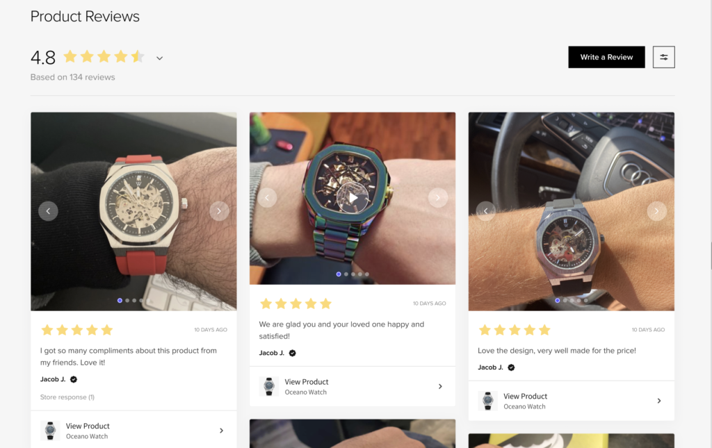
Consider incorporating customer reviews directly on your product pages. After all, displaying UGC content on your product page increases conversions by 28%.
Choose a visually appealing format that stands out without distracting from the overall design.
You can display individual reviews with star ratings or even include snippets of testimonials that highlight the positive experiences your customers have had with your products.
Showcasing Average Star Ratings and Review Counts
Make it easy for your customers to quickly gauge the quality of your products by prominently displaying average star ratings and review counts. This information provides a snapshot of the overall satisfaction level of previous buyers.
Consider placing average star ratings and review counts near the product title or price. For example, you could use a visually appealing star icon followed by the average rating and the number of reviews. Or you can create a custom rating icon like Fiji Water did using Fera.
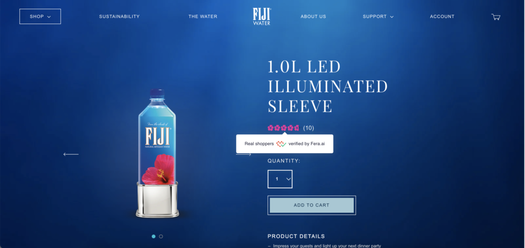
This quick glance allows potential customers to see that others have had positive experiences, making them more likely to trust and purchase your products.
Encouraging Customers to Leave Reviews Through Follow-Up Emails
As a small team, finding time to gather reviews can be challenging. But fear not because there are ways to automate the process and encourage customers to leave feedback. Consider implementing a follow-up review request email strategy.
After a customer makes a purchase, send them a personalized message expressing your gratitude and asking them to share their experience by leaving a review via email. Include a direct link to the review section of your product page to make it as easy as possible for them to leave feedback.
Don’t forget to thank them in advance for their time and assure them that their feedback is valuable to you.
Utilizing Third-Party Review Platforms for Added Credibility
In addition to displaying reviews on your product pages, consider utilizing third-party review platforms for added credibility. These platforms, such as Fera Product Reviews App, allow customers to leave reviews directly on your store and provide a centralized location for potential customers to read authentic feedback.
Fera Product Reviews App integrates seamlessly with your Shopify store and offers features like review widgets, photo reviews, and customizable display options. It’s a powerful tool to gather and showcase social proof effectively.
To provide you with some inspiration, here are a few examples of stores that effectively use the Fera Product Reviews App to display customer reviews:
Example: ESPI/LANE
Espilane incorporates the Fera Product Reviews App to display customer reviews and ratings for their stylish clothing, adding credibility and trust to their product pages.
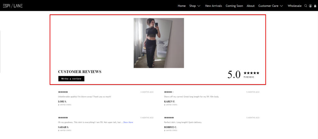
Remember, displaying social proof and customer reviews is a powerful way to build trust, showcase your product’s quality, and boost conversions.
Free Shipping and Returns Information
Let’s cover optimizing your product pages with free shipping and return information to drive conversions.
Incorporating a Prominent Free Shipping Bar or Banner

One essential thing you should implement on the product page that can significantly boost your conversions is a prominent free shipping top bar or banner. By highlighting that shipping is on the house, you can effectively entice your customers and motivate them to make a purchase.
Consider integrating a visually appealing banner at the top of your product page, clearly stating your free shipping offer. Use eye-catching colors and compelling copy to grab attention and communicate the enticing benefit of free shipping. This will create a positive impression and encourage customers to explore your products further.
With the help of an app like Essential Apps Free Shipping Bar, you can easily implement a customizable top bar that displays your free shipping offer. This app allows you to customize the design, colors, and messaging of the bar to align with your branding and capture your customers’ attention.
Incorporating a prominent free shipping bar or banner provides a clear and compelling incentive for customers to complete their purchases. It eliminates any hesitations they may have regarding shipping costs, making your products more appealing and driving higher conversion rates.
Remember, in e-commerce, every small optimization can make a big difference. So, don’t underestimate the power of a well-placed free shipping top bar or banner on your product pages. Give it a try and watch as it helps you attract and convert more customers.
Displaying Clear Shipping and Delivery Information
Transparency is key when it comes to shipping and delivery information. Make sure to display this information clearly and prominently on your product pages. Customers want to know when they can expect their order to arrive and what shipping options are available.
Include estimated delivery times, shipping methods, and any relevant shipping fees or restrictions.
You can present this information in a concise and visually appealing format, such as a table or bullet points, to make it easy for customers to digest.
Highlighting Any Special Shipping Promotions or Discounts
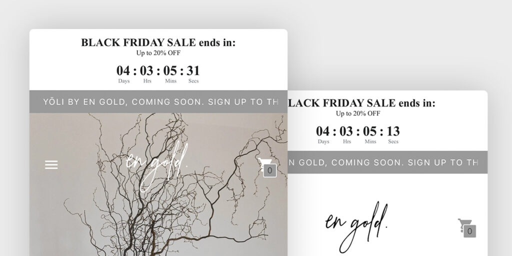
If you have any special shipping promotions or discounts, make sure to highlight them on your product pages by adding a countdown timer. These can be powerful incentives for customers to take action and make a purchase.
For example, if you offer free expedited shipping for a limited time or a discount on shipping for orders above a certain value, emphasize these promotions near the product price or in a dedicated section. This creates a sense of urgency and encourages customers to complete their purchases to take advantage of the offer.
To provide you with some inspiration, here are a few examples of stores that effectively incorporate free shipping and returns information on their product pages:
Example: Everlane
Everlane: Everlane prominently displays their free shipping offer at checkout, creating a sense of value and convenience for their customers
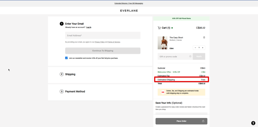
Now, let’s move on to practical CTAs (Call-to-Action) to optimize your product pages further.
Practical CTAs (Call-to-Action)
Strategic and visually appealing CTAs (Call-to-Action) can make all the difference when it comes to driving conversions. Let’s explore some practical tips to enhance your CTAs and maximize your product page conversions.
Placing a Clear and Visually Appealing Add to Cart Button
The “Add to Cart” button is a crucial CTA that should be prominently displayed on your product pages. Make sure it stands out and is easy to find, so customers can quickly take the desired action.
Consider using a contrasting color for the button, such as a vibrant or complementary hue, to make it visually appealing and noticeable. Ensure the button text is clear and concise, using actionable language like “Add to Cart” or “Buy Now” to encourage immediate action.
Utilizing Urgency and Scarcity in CTAs
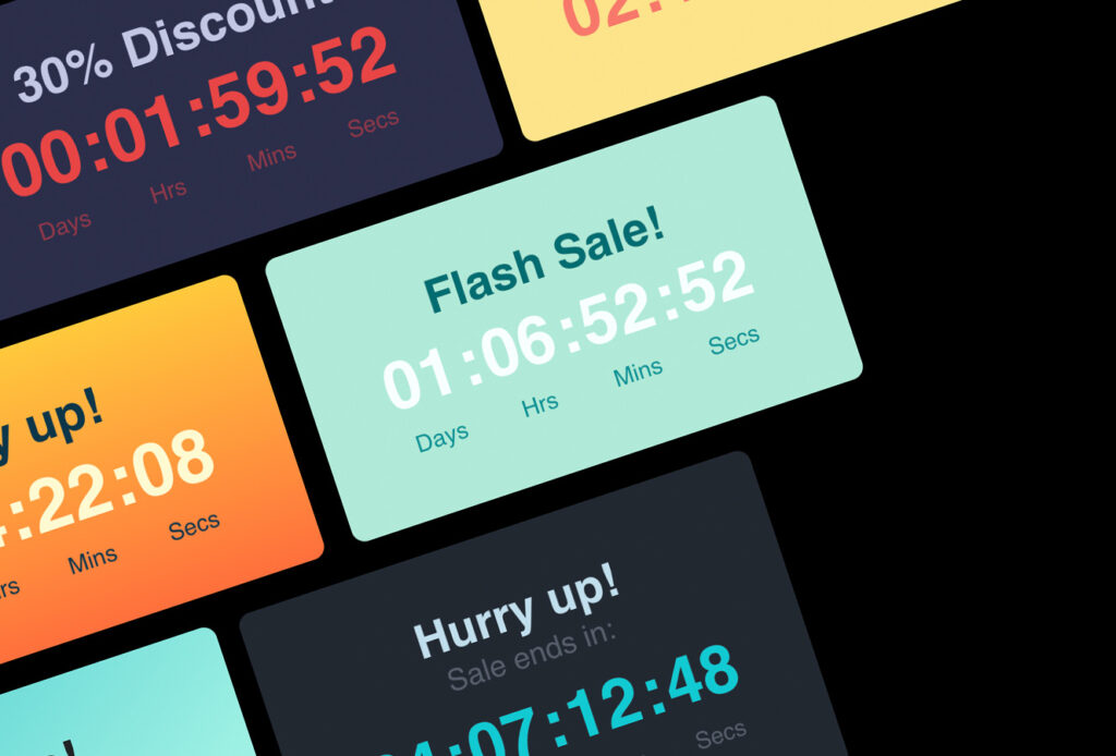
Creating a sense of urgency and scarcity can be powerful motivators for customers to make a purchase. Incorporate these elements into your CTAs to encourage immediate action and prevent potential buyers from procrastinating.
For example, you can include phrases like “Limited Stock!” or “Flash Sale!” near your CTAs to create a sense of urgency. This communicates that the product is in high demand or that a special promotion is time-sensitive, motivating customers to act swiftly.
Incorporating Trust-Building Elements near CTAs
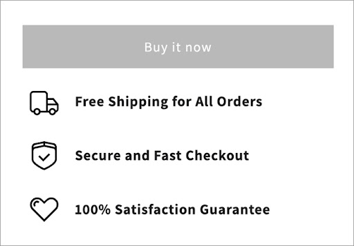
Building trust is crucial in e-commerce, especially for small teams like yours. Incorporate trust-building elements near your CTAs to alleviate any concerns and enhance customer confidence.
Consider adding secure payment icons, trust seals, or guarantees near your CTAs. These visual cues assure customers that their personal and payment information is protected, boosting their trust in your store and increasing the likelihood of completing a purchase.
Conclusion
Congratulations! You’ve now learned valuable insights on optimizing your product pages for higher conversion rates.
Importance of Optimizing Product Pages for Higher Conversion Rates
Optimizing your product pages is crucial for driving higher conversion rates and ultimately growing your e-commerce business. By implementing the strategies discussed, such as:
- Clean design
- Compelling product descriptions
- Social proof and reviews
- Free shipping and returns information
- Practical CTAs,
you can create an exciting shopping experience that motivates customers to take action.
When your product pages are optimized, you increase the chances of converting visitors into paying customers.
Remember, you have the power to create engaging product pages that captivate your customers and boost your conversions.
Best of luck on your journey to creating high-converting product pages! With your dedication and implementation of these strategies, your e-commerce business is bound to reach new heights.
About Jameela

Jameela is the owner of the Shopify store Alora Boutique and the Marketing & Partnerships Manager for the Product Reviews App Fera.ai. You can find her on the interwebs on LinkedIn and Instagram


