Most Shopify stores convert between 1% and 2% of their visitors. The stores in the top tier convert at 3%, 4%, even higher. The difference rarely comes down to better products or more traffic. It comes down to fewer friction points between a visitor and a purchase.
This guide walks through how to increase your Shopify conversion rate in practice: what to fix first, why it works, and what to use to do it. No theory, no generic best practices. Just the changes that consistently move the number.
The average Shopify store converts at around 1.4%. Moving from 1.4% to 2% on a store doing $500K/year is worth roughly $214K in additional revenue, with the same traffic.
Before You Start: Know Your Baseline
Increasing your conversion rate starts with knowing what it actually is, and understanding where in your funnel you’re losing people.
Open Shopify Analytics or Google Analytics and check three numbers:
- Overall conversion rate. Sessions divided by completed orders. This is your headline number.
- Add-to-cart rate. What percentage of visitors add something to cart? If this is low, the problem is on your product pages. If it’s healthy but conversion is low, the problem is in your cart or checkout.
- Checkout completion rate. Of the people who start checkout, how many finish? Below 50% is a significant problem, as something in checkout is creating hesitation.
These three numbers tell you where to start. Fixing the wrong part of the funnel first is the most common reason CRO efforts stall.
Step 1: Fix Your Product Pages First
Product pages carry more conversion weight than any other part of a Shopify store. A visitor on a product page is already interested, the job of the page is to remove the remaining reasons not to buy.
Most product pages lose conversions the same way: they create uncertainty at the moment of decision. Shoppers who don’t know when their order will arrive, can’t easily return it, or aren’t sure the product is right for them will leave without buying, even when the product itself is exactly what they want.
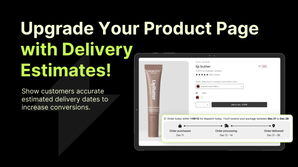
Add estimated delivery dates
Delivery uncertainty is one of the most consistent conversion killers on Shopify product pages. Shoppers know what they want but won’t commit if they can’t picture when it arrives, especially for time-sensitive purchases or gifts.
Adding a clear, dynamic estimated delivery date directly on the product page (and not buried in a shipping policy page) removes this hesitation at the moment it matters most. The format that works: “Order in the next 4 hours and get it by Thursday, April 3.”
Specific delivery messaging on product pages consistently outperforms generic shipping copy. The more specific the date, the higher the conversion impact.
Make trust signals visible without hunting
Return policy, payment security, and money-back guarantees all reduce purchase risk. The problem is that most stores bury these in the footer or on a separate policy page. By the time a hesitant shopper thinks to look, they’ve already left.
Trust signals belong on the product page itself, near the add-to-cart button, where the buying decision is being made. Payment icons, a clear return window, and a single-line security guarantee are often enough.
Answer the unasked questions
Every product has a set of questions shoppers ask before buying. “Will this fit?” “What’s it made of?” “How does it compare to X?” If those questions aren’t answered on the page, the shopper either emails you (friction), searches elsewhere (lost sale), or leaves.
A product page that pre-answers the top three hesitation questions for that specific product will consistently outperform a more generic one. The best way to find those questions: look at your support inbox and your product reviews.
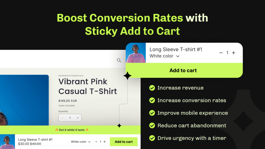
One clear CTA, not three
Multiple competing actions on a product page (Add to Cart, Save to Wishlist, Share, Compare) create decision paralysis. The primary action should be visually dominant and the only thing that demands attention. Sticky add-to-cart bars work well on mobile for this reason: the action stays accessible without interrupting the browsing experience.
Tools that help with Shopify product page CRO
Step 2: Add Urgency That's Actually Real
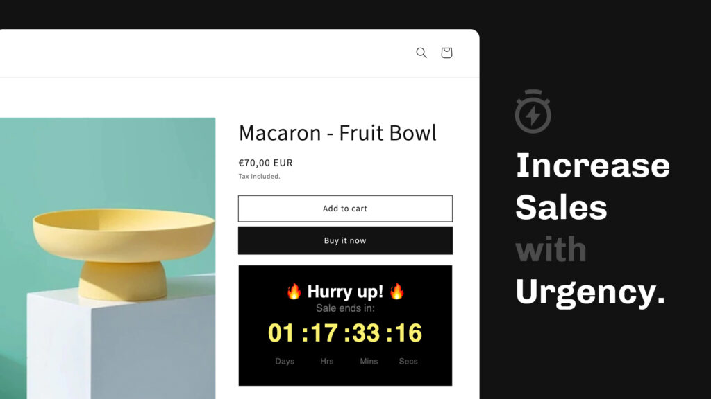
Urgency is the most abused tactic in ecommerce. Fake countdown timers, permanently “expiring” discounts, and manufactured scarcity have trained shoppers to ignore most of it. When you add real urgency, tied to actual stock levels, actual shipping cutoffs, or actual promotions, it still works.
Shipping deadline timers
“Order in the next 3 hours for delivery by Friday” is one of the highest-impact urgency messages in ecommerce because it’s true and specific. This isn’t about pressure — it’s about giving the shopper information they actually want. A countdown timer tied to a real same-day or next-day dispatch cutoff is a service message as much as a sales tool.
Flash sales and limited-time offers
A time-limited discount with a genuine end date converts better than a permanent “sale” for one reason: the deadline is real. Shoppers who see a discount that expires at midnight on Friday know the offer goes away. Shoppers who see a permanent discount mentally treat it as the real price.
Announcement bars and product-page countdown timers work well together here, the announcement bar surfaces the promotion site-wide; the product-page timer closes it at the moment of decision.
The one rule
Urgency only helps when the rest of the page is already doing its job. A countdown timer on a product page with weak copy and no trust signals creates pressure without confidence, which makes things worse, not better. Fix the page first, add urgency after.
In one tested Shopify store, adding a countdown timer to a product page with an already clear offer increased sales by up to 40%. The timer wasn’t the variable, the clear offer was. The timer helped shoppers decide faster on something they already wanted. Learn more.
Step 3: Reduce Cart Abandonment
The average cart abandonment rate in ecommerce is around 70%. Most of that abandonment isn’t because shoppers changed their mind, it’s because something between adding to cart and completing checkout introduced friction or doubt.
Show shipping costs early
Hidden shipping costs revealed at checkout are the single most cited reason for cart abandonment across every major ecommerce study. If your shipping isn’t free, show the cost on the product page or clearly in the cart, before the shopper has mentally committed and then feels surprised.
A free shipping progress bar does the opposite: it gives shoppers an incentive to add more to reach the threshold, which increases both conversion rate and average order value at the same time.
Keep the cart accessible
A slide-out cart drawer that stays accessible as shoppers browse, rather than a separate cart page that takes them away from shopping, reduces friction at the point of decision. It also creates a natural surface for showing upsells, cross-sells, and shipping progress without interrupting the browsing experience.
Use a cart countdown for promotions
When a time-sensitive discount is active, a cart countdown timer reinforces the deadline at the point shoppers are most likely to second-guess themselves. It’s a low-friction nudge that reminds shoppers the window is closing without adding a new step to the process.
Remove unnecessary checkout steps
Every additional field in checkout is a conversion leak. Guest checkout should always be available. Phone number fields that aren’t required for fulfilment should be removed. Address autocomplete should be enabled. Each removed step or field is a measurable conversion improvement.
Step 4: Build Enough Trust to Close the Sale
Most shoppers visiting a Shopify store for the first time have no prior relationship with the brand. The question running in the background, even on a well-designed store, is: “Is this legit? Will this actually work out?”
Trust isn’t one element. It’s the accumulation of small signals across the page that together tell a shopper the store is safe to buy from.
The trust signals that move conversions
- Reviews near the buy button, not just on a dedicated reviews page. Social proof is most effective when it’s in view at the moment of decision.
- Clear return policy, expressed in plain terms on the product page. “Free returns within 30 days” beats a link to a 500-word policy.
- Payment security icons near the checkout button. Most shoppers aren’t consciously checking for these, but their absence creates low-level unease.
- Estimated delivery dates (covered above) are also a trust signal: they communicate that the store knows what it’s doing operationally.
- Consistent design quality throughout. A polished homepage followed by a low-effort product page breaks trust in ways that are hard to identify but easy to feel.
What trust signals don’t fix
Trust signals support conversion decisions, they don’t create them. If the product isn’t clearly positioned, the price seems high for what’s being offered, or the copy doesn’t address real objections, adding badges and icons won’t move the number. Fix the fundamentals first; trust signals amplify a good page.
Step 5: Treat Mobile as the Primary Experience

More than half of Shopify traffic is mobile on most stores. Mobile conversion rates are almost always lower than desktop, not because mobile shoppers are less likely to buy, but because most stores are optimized for desktop and tolerated on mobile.
The most common mobile friction points
- Small tap targets. Add-to-cart buttons that are too close to other elements, or not large enough to tap confidently, cause accidental navigation and frustrated exits.
- Images that don’t zoom properly. Product images on mobile should be swipeable and zoomable. Shoppers making a purchasing decision on a small screen need to see the product clearly.
- Forms that aren’t optimized for mobile keyboards. Email fields should trigger the email keyboard. Numeric fields should trigger the number pad. Small things that create friction in dozens of interactions a day.
- Page speed. Mobile connections are slower. A product page that loads in 2 seconds on desktop might take 5 on a mobile network. Every second of load time above 3 seconds costs measurable conversion.
- Sticky CTAs that aren’t there. On a long product page, a visitor who scrolls past the add-to-cart button shouldn’t have to scroll back to buy. A sticky add-to-cart bar solves this cleanly.
The fastest way to audit mobile conversion: walk through your entire purchase flow on an actual mobile device, on a real network. Not in a browser simulator. You’ll find things in five minutes that analytics would take weeks to surface.
Step 6: Increase Order Value Alongside Conversion Rate
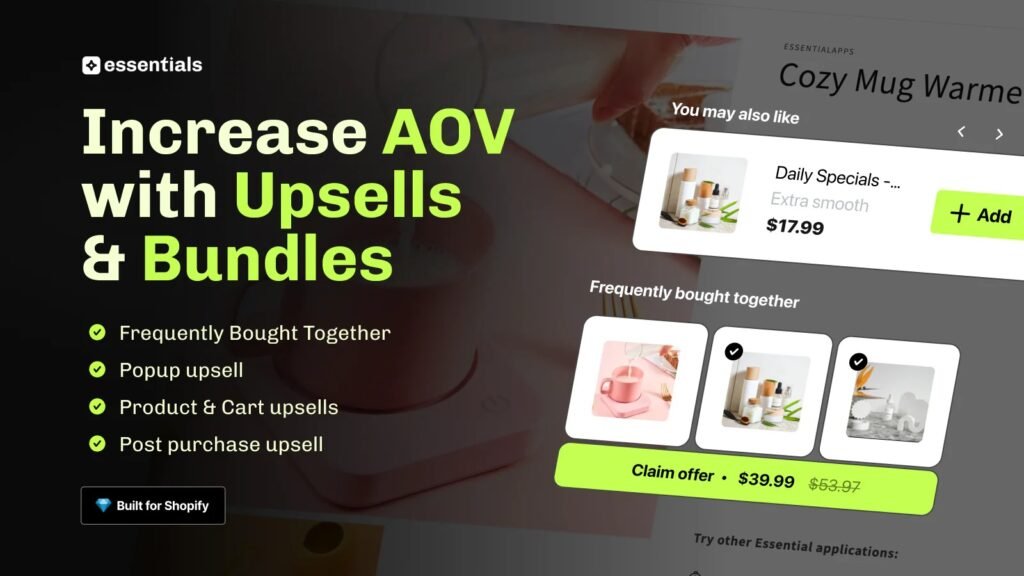
Conversion rate and average order value (AOV) are separate metrics, but they move together with the right tactics. Upsells and cross-sells, when they’re relevant and well-placed, don’t hurt conversion rate. Irrelevant or aggressive ones do.
Where upsells work
- On the product page, before the add-to-cart decision. “Frequently bought together” or a relevant accessory shown near the main product captures demand at peak intent without adding friction to the primary decision.
- In the cart, for low-consideration additions. A complementary product at a price point clearly lower than the main item is an easy yes for a shopper who’s already committed.
- Post-purchase, on the order confirmation page. The shopper has already bought, a relevant follow-up offer here has zero risk of disrupting the original conversion and consistently produces incremental revenue.
What to avoid
Upsell popups that interrupt the checkout flow, offers that aren’t clearly relevant to what the shopper just added, or more than one upsell placement on the same page. The goal is a relevant nudge, not a gauntlet.
Step 7: Test Before You Roll Out
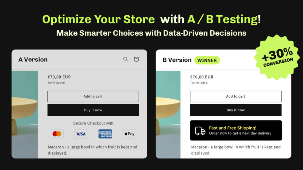
Every change covered in this guide should be tested before being treated as permanent. What works for one store doesn’t always work for another: different products, different audiences, different price points all produce different results.
A/B testing on Shopify doesn’t need to be complicated. The core principle is simple: show variant A to half your traffic and variant B to the other half, measure the difference, and roll out the winner. The key requirement is sufficient traffic: a test on 200 sessions won’t produce reliable conclusions.
What to test first
Prioritize tests on the pages with the most traffic and the most conversion impact. For most Shopify stores that means:
- Product pages: specifically the area around the add-to-cart button
- Cart: particularly shipping messaging and the checkout CTA
- Checkout: fields, layout, and trust signals visible at the final step
Run one test at a time per page. Multiple simultaneous changes make it impossible to know what moved the number.
Putting It Together: Where to Start

The steps above cover the full conversion improvement playbook. If you’re not sure where to begin, use your funnel data to decide:
- Low add-to-cart rate? Start with product pages: delivery clarity, trust signals, copy.
- Good add-to-cart rate but low conversion? The problem is in cart or checkout: shipping costs, friction, trust at the final step.
- Decent conversion rate but low revenue? Work on AOV: upsells, cross-sells, free shipping thresholds.
- Good desktop conversion, poor mobile? The problem is your mobile experience: sticky CTAs, page speed, form UX.
- Everything looks fine but rate is stuck? Run a structured CRO audit. You need a second pair of eyes on the data.
Most stores don’t need to do all of this at once. One well-executed improvement, measured properly, compounds. Pick the step that matches your data and start there.